The Science of Color in Graphic Design
Why Color Is Critical to Design
Color isn’t just decoration—it’s one of the most powerful tools in a designer’s toolkit. The right color choices can evoke emotion, convey brand personality, guide user attention, and drive conversions. When used strategically, color transforms a simple layout into an experience that resonates deeply with audiences. This guide explores the science behind color in graphic design, blending theory, psychology, and practical techniques to help you create visuals that inspire action.
The Psychology of Color
How Colors Influence Emotions
Color has a profound effect on human emotion and behavior. Blues and greens often create a sense of calm and trust, while reds and oranges evoke excitement and urgency. Understanding these emotional triggers allows designers to choose palettes that align with the desired response—whether it’s encouraging a purchase, building credibility, or creating a sense of joy.
Cultural Differences in Color Perception
Color meanings aren’t universal. For example, white is associated with purity in Western cultures but can represent mourning in parts of Asia. Red may symbolize luck in China but danger in other regions. Considering cultural context is essential when designing for global audiences to avoid misinterpretation and create authentic connections.
Color Associations and Brand Identity
Brands leverage color to differentiate themselves and communicate values. Think of Coca-Cola’s bold red or Tiffany’s distinctive robin’s egg blue—these hues are instantly recognizable and evoke specific feelings. Consistent use of color reinforces brand identity, making your visuals memorable and trustworthy.
Color Theory Fundamentals
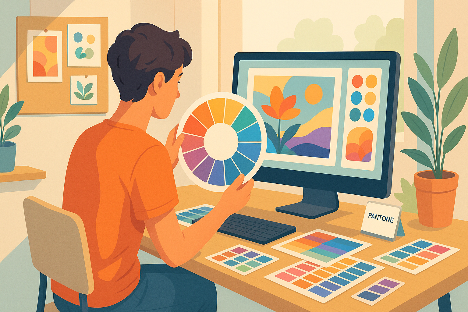
The Color Wheel Explained
The color wheel is the foundation of color theory, showing how primary, secondary, and tertiary colors relate. By understanding these relationships, designers can create harmonious palettes and striking contrasts that enhance visual appeal.
Primary, Secondary, and Tertiary Colors
Primary colors (red, blue, yellow) can’t be created by mixing other hues. Combining them produces secondary colors (green, orange, purple), while blending primary and secondary colors creates tertiary hues. Mastering these basics enables you to build a cohesive palette that balances vibrancy and subtlety.
Warm vs. Cool Colors
Warm colors (reds, oranges, yellows) feel energetic and inviting, while cool colors (blues, greens, purples) evoke calm and professionalism. Using the right balance of warm and cool tones guides emotion and creates visual contrast that holds attention.
Color Harmony and Contrast
Complementary Color Schemes
Complementary colors sit opposite each other on the color wheel, such as blue and orange or red and green. When paired, they create vibrant contrast that draws the eye. Designers often use complementary colors to highlight calls to action or important information without overwhelming the viewer.
Analogous Color Palettes
Analogous colors are neighbors on the color wheel—like blue, teal, and green. These combinations feel harmonious and balanced because they share undertones. Analogous palettes are ideal for creating soothing designs that guide the viewer gently through content.
Triadic and Tetradic Combinations
Triadic schemes use three evenly spaced colors (e.g., red, blue, and yellow), while tetradic schemes use four colors in a rectangle formation on the wheel. These approaches offer variety and visual richness but require careful balance to avoid clutter. When applied skillfully, they produce dynamic, engaging compositions that feel cohesive.
Color in Branding and Marketing
Building Recognition Through Consistent Color
Consistency is key in branding. Using the same color palette across logos, websites, packaging, and advertising reinforces recognition and trust. Over time, customers come to associate those colors with your brand’s values and personality.
Case Studies of Iconic Color Use
Consider McDonald’s golden arches or Spotify’s vibrant green. These brands have built equity around signature colors, making their visuals instantly identifiable. By studying such examples, designers can learn how to harness color for lasting impact.
Psychological Triggers in Advertising
Color drives behavior in marketing. Red can create urgency for sales, blue fosters trust in financial services, and yellow stimulates optimism in lifestyle brands. Leveraging these psychological triggers helps campaigns resonate with target audiences on an emotional level.
Accessibility and Color
Designing for Color Blindness
Approximately 1 in 12 men and 1 in 200 women have some form of color blindness. Relying solely on color to convey information can exclude these users. Use patterns, labels, and icons alongside color to ensure everyone can understand your message.
Contrast Ratios and Readability
Text must have sufficient contrast against backgrounds to remain legible. The Web Content Accessibility Guidelines (WCAG) recommend a contrast ratio of at least 4.5:1 for normal text. Tools like contrast checkers help verify compliance and improve usability.
Tools for Testing Color Accessibility
Accessibility tools such as Stark, Color Oracle, and the WAVE browser extension simulate how designs appear to users with vision impairments. Regularly testing your color choices helps you create inclusive, user-friendly experiences.
Digital vs. Print Color Spaces
RGB and CMYK Explained
RGB (Red, Green, Blue) is the color space used for digital screens. Colors are created by mixing light, which allows for bright, vivid hues. CMYK (Cyan, Magenta, Yellow, Black) is used in print, blending inks to create color. Converting between RGB and CMYK requires care to maintain color accuracy, as some bright RGB colors can’t be reproduced exactly in print.
Spot Colors and Pantone Matching
Spot colors are pre-mixed inks used to achieve precise colors, often via the Pantone Matching System (PMS). Designers use spot colors for brand consistency, especially in logos and packaging, because they ensure predictable results across different print runs.
Preparing Files for Consistent Output
To avoid surprises in production, always convert your files to the correct color space before sending them to print. Use calibrated monitors, proof prints, and color profiles to ensure the colors you see on-screen are as close as possible to the final output.
Using Color to Guide User Attention
Focal Points and Visual Hierarchy
Color can direct the eye to what matters most. Bold, high-contrast colors are perfect for focal points, like buttons or calls to action, while muted tones recede into the background. Establishing a clear hierarchy helps users navigate content effortlessly.
Call-to-Action Color Strategies
Buttons and interactive elements often rely on standout colors to prompt action. A bright, contrasting button color (like orange or green) can significantly improve click-through rates. Consistency is important—using the same color for all primary actions reduces confusion.
Avoiding Overstimulation
Too many bright or clashing colors can overwhelm users. Use color sparingly to highlight key elements and support readability. A balanced palette with plenty of whitespace keeps designs clean and user-friendly.
Emotional Branding Through Color
Evoking Trust with Blues and Greens
Blue is often associated with trust, security, and calmness, which is why it’s common in finance and healthcare brands. Green symbolizes growth, balance, and sustainability, making it popular with wellness and eco-friendly companies.
Creating Excitement with Warm Colors
Red and orange are powerful tools for sparking excitement and urgency. Used thoughtfully, they can energize a design and encourage immediate action. However, overuse can lead to visual fatigue or feelings of aggression, so moderation is key.
Neutral Palettes and Minimalist Aesthetics
Black, white, and gray can convey sophistication and clarity. Neutral palettes are ideal for minimalist brands that want their content and product imagery to take center stage without distraction.
Cultural Considerations
Western vs. Eastern Color Meanings
Colors can hold very different meanings across cultures. In Western countries, white is often associated with purity and weddings, while in many Eastern cultures, white represents mourning. Similarly, red is seen as a color of warning or passion in the West, but symbolizes luck and prosperity in China. Understanding these differences is critical for global branding and communication.
Colors in Global Branding
Brands with international audiences must be mindful of color symbolism. For example, a color that resonates positively in one market could carry negative connotations elsewhere. Conducting research and consulting with local experts ensures color choices align with cultural expectations and values.
Navigating Cultural Sensitivities
Even subtle color decisions can impact how a design is perceived. Avoid making assumptions about universal meaning, and when in doubt, test color palettes with representatives from your target audience. Culturally aware design not only prevents misunderstandings but also builds trust and credibility.
Trends in Color Usage
Gradients and Duotones
Gradients have made a strong comeback, adding depth and vibrancy to digital interfaces. Duotones, which blend two contrasting colors, are popular in hero images and social media graphics because they create a modern, dynamic feel.
Bold Neons and Vibrant Accents
Bright, neon accents are trending across industries, especially in tech and creative brands. Used strategically, they bring energy and a contemporary edge to designs. However, neon colors should be balanced with neutral backgrounds to maintain readability and focus.
Earthy and Sustainable Color Palettes
As sustainability becomes a core brand value, earthy tones like olive green, terracotta, and beige are gaining traction. These colors evoke a sense of authenticity, calm, and connection to nature, aligning well with eco-conscious messaging.
Color and Typography
Pairing Text and Background Colors
The relationship between text and background color directly affects readability. High contrast—like black text on a white background—remains the most accessible combination. For creative designs, ensure there is still enough contrast to meet accessibility standards.
Readability and Contrast Standards
The Web Content Accessibility Guidelines (WCAG) recommend a minimum contrast ratio of 4.5:1 for normal text and 3:1 for large text. Tools like WebAIM’s contrast checker help ensure your typography remains legible for all users.
Expressing Tone with Colorful Headlines
Colorful headings can infuse personality and draw attention to key content. For example, a bold red headline can convey urgency, while a soft blue subhead can suggest calm authority. Use colored typography sparingly to avoid overpowering the design.
Measuring the Impact of Color
A/B Testing Color Choices
Even subtle changes in color can dramatically impact engagement and conversions. A/B testing allows you to compare different color treatments—like button colors or background hues—to see which performs better with your audience. Data-driven experimentation helps you refine your palette with confidence.
Analytics and Conversion Rates
Tracking metrics such as click-through rates, bounce rates, and time on page provides insight into how color influences user behavior. For example, switching a call-to-action button from gray to a vibrant accent color can lead to measurable improvements in conversion.
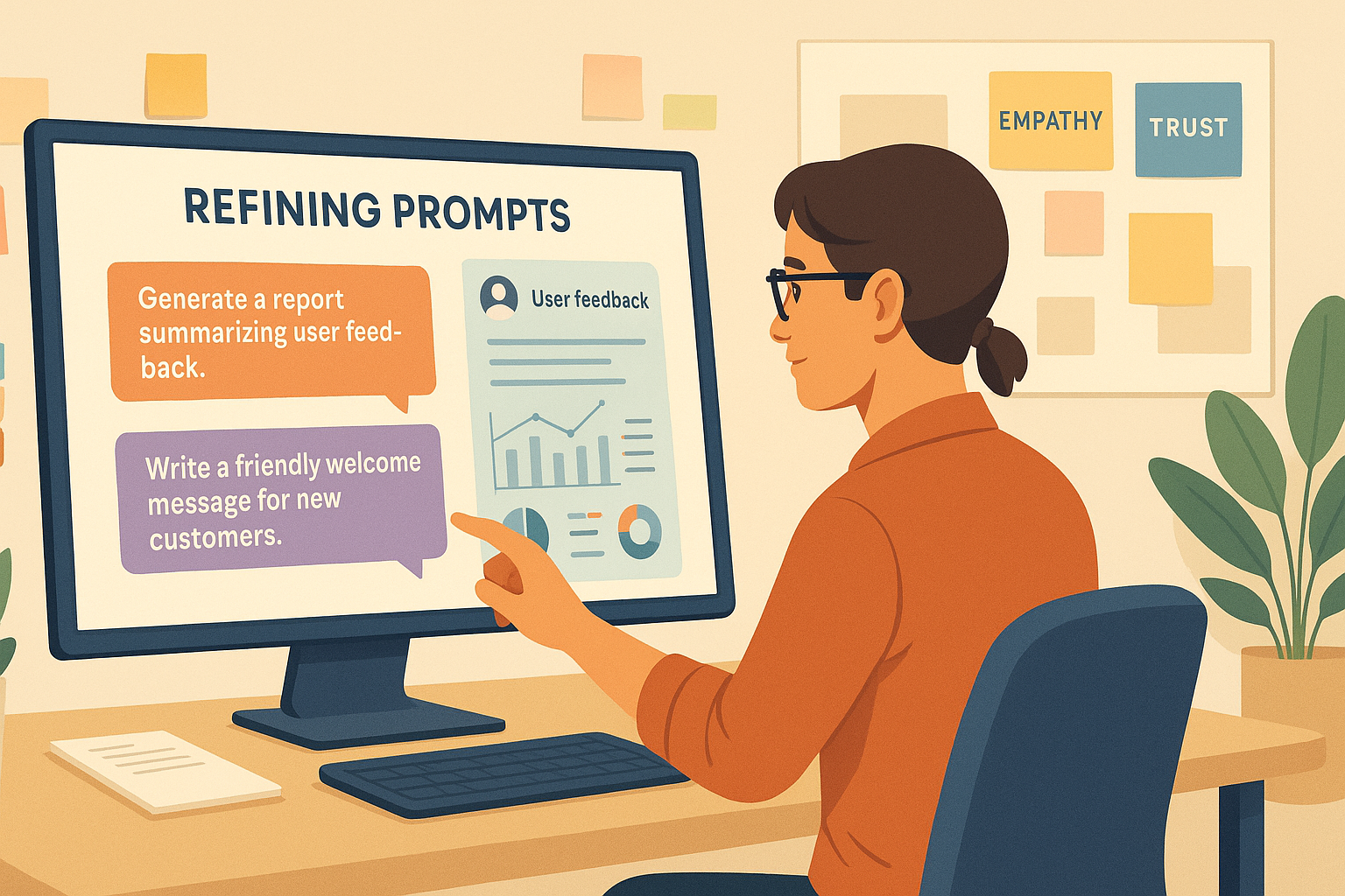
Gathering User Feedback
Quantitative data is important, but qualitative feedback is equally valuable. Surveys, interviews, and user testing sessions can reveal how your audience feels about your color choices and whether they align with your brand values and goals.
Practical Tips for Choosing Colors
Building a Mood Board
Mood boards help you visualize how colors work together before committing to a palette. Collect photos, swatches, and design references that evoke the feelings you want your brand to convey. This process ensures your color decisions are intentional and cohesive.
Using Color Generators
Online tools like Coolors, Adobe Color, and Paletton make it easy to generate harmonious palettes. You can explore complementary, analogous, and triadic combinations, then export your selections for use in your design software.
Testing on Multiple Devices
Colors can look dramatically different across screens and lighting conditions. Always preview your designs on multiple devices—smartphones, tablets, laptops—and in different environments to verify that your palette is consistent and accessible.
Conclusion: The Art and Science of Color Mastery
Color is more than aesthetics—it’s a powerful language that influences perception, emotion, and behavior. By blending the science of color theory with the art of storytelling, designers can create visuals that connect deeply with audiences. Whether you’re building a brand, launching a campaign, or designing an app, understanding the science of color empowers you to craft experiences that are not only beautiful but also effective.
Frequently Asked Questions
What color is best for conversions?
There’s no universal answer—context matters. However, high-contrast colors like red, green, and orange often outperform neutral tones for calls to action because they stand out visually.
How do I choose a color palette?
Start by defining your brand’s personality and goals. Use the color wheel to explore combinations, build a mood board, and test your palette for accessibility and consistency.
How does color impact accessibility?
Low-contrast color combinations can make text and interfaces hard to read, especially for users with vision impairments. Always check contrast ratios and provide alternative cues beyond color alone.
What tools help with color consistency?
Tools like Adobe Color, Pantone guides, and monitor calibration hardware help ensure your colors remain consistent across print and digital formats.
How can I test color effectiveness?
Combine A/B testing, analytics, and user feedback. Monitor engagement metrics and ask users how they perceive your design to ensure your colors are meeting your objectives.
Editor’s Choice


Get started with our best stories
Get all the latest posts delivered straight to your inbox.