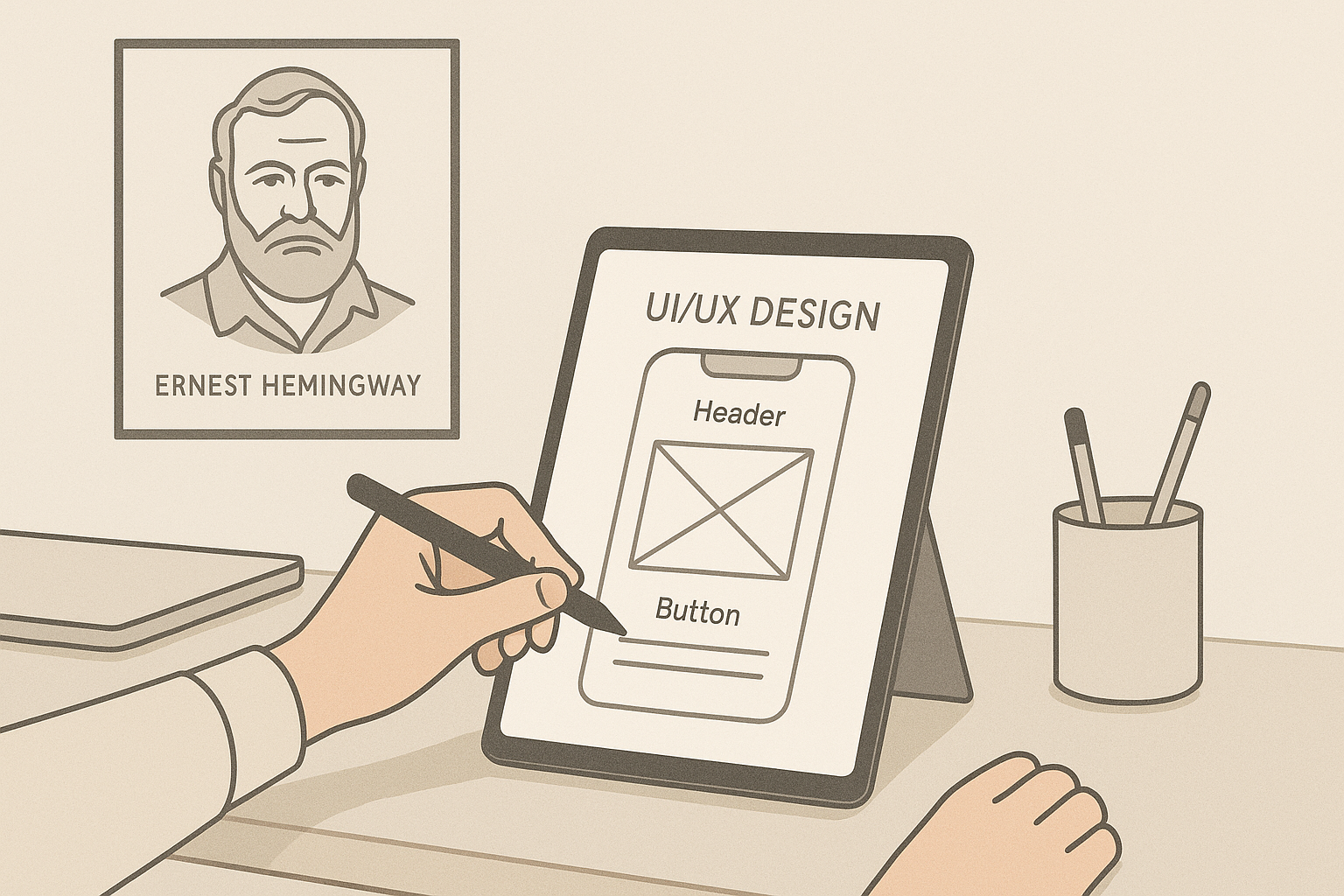
The Art of Simplicity: UI/UX Lessons from Hemingway

Why Hemingway Matters in Design
Ernest Hemingway wasn’t a designer—but his clear, minimal writing style offers profound lessons for anyone creating digital experiences. Just as Hemingway distilled complex ideas into simple, impactful prose, great UI/UX design cuts through clutter to deliver what users need with elegance and clarity. In a world overloaded with information, simplicity is not just a preference—it’s a necessity. This guide explores how Hemingway’s philosophy can inspire interfaces that are focused, accessible, and memorable.
Hemingway’s Writing Philosophy
The Power of Simple, Clear Language
Hemingway believed in using plain words to convey meaning without embellishment. In his view, simple language could evoke more powerful emotions than flowery prose. The same principle applies to interface copy: clear words reduce confusion and build trust.
Removing Unnecessary Words
One of Hemingway’s most famous editing techniques was cutting every word that wasn’t essential. For UI/UX, this means removing redundant labels, excessive instructions, and anything that distracts users from their goals.
Focusing on Essential Details
Hemingway focused only on details that mattered to the story. In design, this translates to prioritizing the most critical information and minimizing visual noise. Every element should serve a purpose.
The Parallel Between Writing and Design
Clarity in Prose, Clarity in Interfaces
Just as a reader shouldn’t struggle to understand a sentence, a user shouldn’t struggle to navigate an app or website. Simplicity in language and simplicity in design both aim to remove barriers to comprehension.
Engaging Users Without Overload
Hemingway engaged readers with vivid stories told simply. Designers can do the same by presenting content and actions in a way that’s inviting without being overwhelming.
Crafting Memorable Experiences
Hemingway’s stories are memorable because they are clear and impactful. Similarly, streamlined interfaces leave a lasting positive impression by making tasks effortless and satisfying.
Minimalism in UI: Less Is More
Reducing Visual Clutter
Minimalism is about intentional reduction. Like Hemingway stripping away unnecessary adjectives, UI designers remove superfluous elements that compete for attention. Clear spacing, limited color palettes, and simple typography all help focus users on what matters most.
Prioritizing Core Actions
Hemingway’s prose always drove the narrative forward. Similarly, effective interfaces guide users toward their primary goals. When designing a screen, ask: “What is the single most important action here?” Then highlight that action visually and remove distractions around it.
Examples of Minimalist Interfaces
Brands like Apple and Google set the standard for minimalist design. Apple’s product pages use whitespace and clean lines to emphasize core content. Google’s search homepage is famously sparse, putting the focus squarely on search itself. These examples demonstrate how simplicity can be a strategic advantage.
Microcopy That Resonates
Writing Clear Calls to Action
Hemingway believed every word should pull its weight. The same applies to microcopy: your calls to action must be precise and compelling. “Buy Now,” “Start Free Trial,” and “Download Guide” are clear, direct prompts that remove ambiguity.
Humanizing Error Messages
Instead of generic messages like “Error 404,” use plain language to explain what happened and what the user can do next. For example: “We couldn’t find that page—check the URL or return to the homepage.” Simple, empathetic copy reassures users when things go wrong.
Simplifying Onboarding Text
Hemingway’s sentences were short and approachable. Onboarding flows benefit from the same clarity. Break complex concepts into digestible steps, avoid jargon, and write in a warm, friendly tone that helps users feel confident from the start.
Information Hierarchy Inspired by Hemingway
Leading with the Most Important Information
In Hemingway’s work, the first sentence often carried the core idea. In UI, this means positioning key content and actions above the fold so users see them immediately. Don’t bury the lead—make the main point instantly visible.
Structuring Content for Skimmers
Just as Hemingway wrote in short, impactful paragraphs, design your content for users who skim. Use headings, bullet lists, and bold text to create clear visual hierarchies that guide the eye.
Visual Cues to Guide Users
Whitespace, icons, and color can reinforce your hierarchy and direct attention. A minimalist aesthetic doesn’t have to feel empty—it should feel purposeful, with every visual cue supporting clarity.
Consistency and Familiarity
Repetition for Reinforcement
Hemingway often repeated key phrases to reinforce his themes. In UI/UX, consistency in layout, navigation, and language helps users learn patterns and build confidence. For example, keeping button styles the same across your platform reduces cognitive friction.
Familiar Patterns to Build Trust
Just as readers trust familiar narrative structures, users trust interfaces that follow established conventions. Standard icons, predictable placement of navigation, and common interaction models (like swiping to delete) make your product feel intuitive and safe.
Aligning Language with Design Elements
Hemingway’s words and tone always matched the story’s mood. In design, copy and visuals should align seamlessly. A minimalist interface with simple, direct language creates a cohesive experience that feels intentional and polished.
Tone and Voice: Empathy in Simplicity
Crafting a Warm, Approachable Voice
Hemingway wrote in a voice that felt human and authentic. Your product’s tone should do the same. Even simple interfaces benefit from a warm, conversational voice that puts users at ease.
Avoiding Jargon and Complexity
Hemingway’s style was known for its lack of pretension. Avoid jargon, technical language, and complicated sentences in your microcopy and instructions. Plain language ensures clarity for all users, regardless of background.
Adapting Tone Across Contexts
While simplicity is consistent, tone can adapt depending on context. An error message might require empathy, while a success notification can feel celebratory. Think about how Hemingway shifted tone subtly to match his subject—and do the same in your design.
Accessibility and Inclusive Design
Using Plain Language for All Users
Accessibility starts with clarity. Hemingway’s plain language is a model for writing that works across literacy levels and languages. Clear, concise copy supports users who rely on screen readers or translation tools.
Designing for Cognitive Load Reduction
Minimalist design reduces the mental effort required to understand and interact with your product. Limit options on each screen, avoid distractions, and chunk information into manageable pieces to support neurodiverse users.
Ensuring Clarity for Assistive Technologies
Every user deserves a great experience. Use descriptive labels for buttons, clear alt text for images, and consistent markup so assistive technologies can interpret your interface accurately. Simplicity in structure improves accessibility by default.
Storytelling in User Experience
Creating a Narrative Flow
Hemingway knew how to guide readers through a story arc. In UI/UX, create clear narrative flows that lead users step by step. Whether it’s onboarding or checkout, every action should feel like the next logical part of the story.
Emotional Connection Through Simplicity
Simple design can evoke powerful feelings. By removing distractions, you allow users to focus on what matters—achieving their goals, connecting with your message, and feeling understood.
Hemingway’s Iceberg Theory in UX
Hemingway believed most meaning lies beneath the surface. In design, show only what users need at each step, while deeper options remain discoverable. This balances simplicity and power, inviting exploration without overwhelming.
Case Studies: Brands Inspired by Simplicity
Apple’s Clean Interfaces
Apple’s design ethos is minimalist to its core: whitespace, clear typography, and intuitive navigation. Every element exists for a reason, echoing Hemingway’s approach to essential details.
Medium’s Focused Reading Experience
Medium’s clean layout removes distractions so readers can focus on content. Subtle design touches like progress bars and elegant typography enhance usability without clutter.
Dropbox’s Clear Messaging
Dropbox simplifies complex cloud storage with friendly copy and clean visuals. Simple microcopy and intuitive interfaces make the experience accessible to all users.
Common Pitfalls in Simplified Design
Oversimplification that Confuses
Too much reduction can leave users uncertain. Labels that are too vague or icons without text can create guesswork. Clarity must never be sacrificed for minimalism.
Lack of Context
Hemingway’s brevity never lacked substance. Similarly, minimal interfaces should always provide context—through tooltips, onboarding guides, or inline help—so users understand their choices.
Sacrificing Functionality for Minimalism
While clean design is appealing, removing critical features can frustrate users. Always balance simplicity with functionality to ensure the experience still meets user needs.
Practical Steps to Simplify Your UI/UX
Conducting Content Audits
Review every piece of content and interface element. Ask: “Does this serve a purpose?” If not, remove or rework it.
Testing with Real Users
Observe how users interact with your design. If they hesitate or ask questions, that’s a sign your interface may be too complex or too sparse.
Iterating on Feedback
Simplicity is an ongoing process. Continuously refine your content and layouts based on analytics and user feedback.
Tools and Resources for Simple Design
Hemingway App for Clear Copy
This free tool helps you write concise, readable copy by highlighting complex sentences and passive voice.
UI Kits for Minimalist Design
Pre-made UI kits offer clean components that reduce visual clutter while maintaining usability and consistency.
Accessibility Guidelines
Follow standards like WCAG to ensure your simple designs are also inclusive and usable for everyone.
Conclusion: Designing with Simplicity and Purpose
Hemingway’s legacy proves that simplicity is not about removing meaning—it’s about distilling it. In UI/UX, clarity, empathy, and purpose create experiences that are both elegant and effective. By embracing minimalism with intention, you honor your users and make every interaction count.
Frequently Asked Questions
How does Hemingway’s style apply to design?
Hemingway’s focus on clarity, brevity, and essential detail inspires interfaces that are simple, effective, and user-centered.
What are the best tools to create simple UI?
Consider Figma for prototyping, the Hemingway App for clear copy, and Stark or Wave for accessibility checks.
How can I balance simplicity and functionality?
Prioritize core tasks, provide context where needed, and avoid removing features essential to user goals.
Why does minimal design improve usability?
Minimal design reduces cognitive load, making it easier for users to understand and complete tasks without distraction.
How do I measure the effectiveness of simple UX?
Use analytics, usability tests, and customer feedback to track task completion rates, engagement, and satisfaction.
Editor’s Choice
Get started with our best stories
Get all the latest posts delivered straight to your inbox.


